POSTERS: Tips, Tricks & Past AAP Winners
The Poster Sessions at the AAP Annual Meeting have become increasingly popular over the years: both in overall submissions and viewing. AAP introduced E-Posters to the Annual Meeting in 2022 with great success. The new "set-up and tear-down" process is as simple as a click of the button. Poster presenters no longer need to worry about carefully transporting, storing or locating their paper poster!
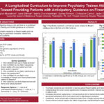
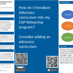
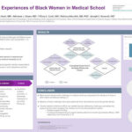
AAP has found some great tips from other well-known institutions to share for creating digital posters. Please see the links regarding formatting and a few template suggestions below. Additionally, we have some basic rules: begin your work on a 16:9 widescreen powerpoint slide, keep your fonts simple and no smaller than 12-15 point size. For more visuals, take a look at examples of past AAP Poster Winners for inspiration.
Questions? Concerns? Please contact Poster Subcommittee Chair Scott Oakman, MD
POSTER TIPS & TRICKS FOR FORMATTING from UIC
FROM UNC UNIVERSITY LIBRARIES: TEMPLATE LAYOUT IDEA 1
FROM UNC UNIVERSITY LIBRARIES: TEMPLATE LAYOUT IDEA 2
FROM UNC UNIVERSITY LIBRARIES: TEMPLATE LAYOUT IDEA 3
AAP ANNUAL MEETING POSTER AWARD WINNERS
2023 Annual Meeting Poster Winners
***We apologize for the partial view. We are working to get this fixed. To see the entire poster, please click here.


